Rent distributions in American’s urban areas

At City Observatory, Daniel Kay Hertz convincingly demonstrates that affordability can’t always be measured using aggregate figures, like median home value:

For an illustration of this problem, imagine two neighborhoods. In both places, the median home costs $300,000. But in the first neighborhood, every home costs exactly $300,000, while in the second, there are a range of homes from $100,000 to $500,000. Although both neighborhoods have the same median home price, the second neighborhood has some homes affordable to low-income people, while the first neighborhood does not.

More important to our understanding of affordability is the distribution of home prices and rent, which Hertz goes on to explore at the neighborhood level in Chicago. This is an incredibly under-discussed topic in the broader housing affordability debate.

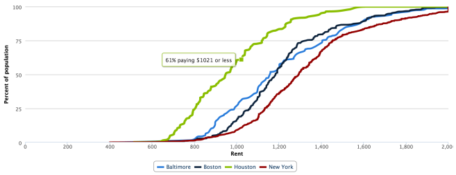
Using census data, I put together an interactive chart that allows us to compare the affordability of American cities at all levels of the distribution — not just the median, as we virtually always see reported. Here’s what it looks like (click to launch):

Screen Shot 2015-11-15 at 4.31.24 PM

The X axis measures rent; the Y axis measures the percent of the city’s population living in a ZIP code where the median rent is less than X. For example, in the chart above, we see that 61% of Houstonians live in a ZIP code where the median rent is no more than $1021. The further a city’s series is to the right, the more expensive it is.

A few technical notes:

  • The data comes from the 2013 5-year ACS estimates. The rent variable is gross rent (includes utilities). Unfortunately, any ZIP where median rent is greater than $2000 is coded as $2000.
  • I used ZIP codes, and not a more granular level of geography like census tracts, because the margin of error becomes prohibitively large.
  • Cities are defined as census-designated urban areas.
  • One drawback here is that the census doesn’t disaggregate rent statistics by bedroom. A $1000 1BR apartment is much more expensive than a $1000 2BR apartment, but here they’re counted as equally affordable. This is only a problem for cross-city comparison if cities are meaningfully different in their makeup of housing stock.
  • Remember, this is census data, so it’s representative of all rental units, not just market rate. That’s why, for example, NYC looks relatively inexpensive here, at least compared to cities like DC where market rate housing is cheaper but there isn’t as large a rent-controlled housing stock.

Let me know (on Twitter, ideally) if you have any comments or suggestions!

Posted in Uncategorized | Leave a comment

Can we stop using the word “subsidy”?

Here are two sub-headlines in a Streetsblog post about recent transportation referendums:

Seattle’s property tax increase to fund walking, biking, and transit

Voters have spoken and they decided to enact Move Seattle, the $900 million property tax levy for transportation.

and:

The constitutional mandate to subsidize highways in Texas

In Texas, voters overwhelming passed Prop 7, a sales tax measure that will generate revenue for free highways.

In fiscal terms, these two scenarios are identical: A tax is being levied to fund a specific transportation initiative. Revenue comes from non-users in both. It’s not that there’s no practical difference between the two — there’s literally no difference.

And yet look at the language: One is a subsidy, the other a simple funding mechanism. These, of course, are loaded terms. “Subsidize” is a dirty word in these parts of the urban blogosphere — it implies an undeserved, unreciprocated transfer at the expense of everyone else. We often hear about how transit is chronically “underfunded”, but never how it’s chronically under-subsidized. No transit agency in America runs an operating surplus, let alone a profit that could pay for capital upgrades, and yet we bicker about how tolls and gas taxes don’t cover the costs of new highway spending.

Guys, this is a losing framework.

Now, I think noting that drivers don’t “pay their way” is useful — insofar as we’re focused on dispelling that myth. But to say there’s something categorically wrong with the fact that highways are “subsidized” is an argumentative disaster waiting to happen. It appears to me there are a two similar but distinct meanings of “subsidy” here:

  1. A transportation project is funded with any type of revenue at least partly paid for by non-users.
  2. A transportation project is better-funded with any type of revenue at least partly paid for by non-users, relative to other modes.

Each of these has problems. If you use definition #1, your argument quickly reaches a troubling conclusion: that every transit project has to be completely self-funded. True, transit is (operationally) profitable in places like Japan and Hong Kong. Maybe you think that transit could pay for itself if we axed all spending on roads (lol) and we completely did away with zoning (LOL). But practical futility aside, this is America we’re talking about, and I’d imagine it’d take generations to reach a Tokyo-esque equilibrium where densities are high enough to support self-sustaining transit.

And to be clear, this is the hard-line, deontological libertarian argument to make — that government spending is unjust in and of itself. I’d wager most urbanists are uncomfortable with that.

Definition #2 is more subtle. Here, a mode of transportation is subsidized if the playing field is tilted in its favor. If transit gets $100 and roads get $200, definition #1 would dictate that both are subsidized, but under definition #2, only roads are. Think of it as a net subsidy.

But if we argue that the playing field needs to be leveled, we run into the practical problems presented by definition #1. What if transit needs more funding than roads to be effective? Do we pack up and go home, sell our buses and close our subways? What if we even out the funding, only to find that the benefits of an additional dollar of transit funding at that point outweigh the costs? Surely this would be “subsidization” under this framework, for which we’ve been demonizing roads. You can see how inflexible that becomes.

The point I’m trying to make is that talking about subsidies pushes you into a narrow, tortured framework. The political realities of the US and the economics of utility-like infrastructure are such that we’ll never approach a world in which transportation projects aren’t subsidized, whatever that even means. So instead, go utilitarian: why not argue for additional transit funding on its merits alone?

Make your arguments on grounds of social and racial justice. Point out the economic benefits of urban agglomeration that good transit allows for. Talk about the public health angle, or about climate change. The enormous land-use implications. Public space efficiency. Congestion. The fiscal costs of sprawl. Traffic fatalities. Etc etc etc.

Seriously, we have so many to choose from. It’s not difficult. No reason to back yourself into a corner, to pick a fight that you’re not going to win.

Posted in Uncategorized | Leave a comment

Housing options at the census-defined urban area level

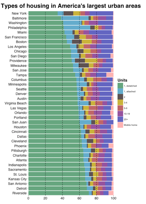
Wonkblog ran a great little post yesterday where they looked at the distribution of housing options (suburban-style SFR, rowhouse, multifamily by number of units, etc) in American cities. Here’s what their chart looks like:

One potential problem here is that cities have arbitrary political boundaries which makes cross-city comparison difficult. A better geographic unit is the census-designated urban area, the boundaries of which are determined by starting in the middle of a city and moving outwards until population densities dip below a certain threshold.

So on this slow papal visit day where everything has come to a standstill, I took Emily and Chris’s idea and applied it to UAs, via ggplot2. Here’s what it looks like for the 40 largest UAs:

Rplot

A few notes:

  • Atlanta looks much less dense. Its suburbs are basically the worst, as Let’s Go LA documents so well here.
  • Houston, too.
  • Philly drops from lowest detached SFR rate to fourth lowest. Anecdotally this seems right to me, my friends and I having grown up in super low-density Bucks county sprawl.
  • This data (from the ACS) is self-reported. I wonder how many people misunderstand the question and how this affects the estimates. For example, the data claims there are 5,600 detached single family homes in Manhattan, which is obviously wrong. I also wonder how someone might characterize something like this, which makes up a huge portion of housing in Pittsburgh:

Untitled111

Fun stuff. Maybe another cool angle here would be to measure land area by type of housing, rather than a simple count of units.

Posted in Uncategorized | Leave a comment

Interactive graph: Population density distributions

Land use twitter has been on a population density kick recently. These exchanges motivated me to put together an interactive graph of population density distributions, something I’ve been meaning to do for a while. (Many thanks to @woolie and this blog post, whose work I’ve borrowed heavily from!)

So here it is. There are two drop downs: one for selecting cities to plot, and another for choosing the y axis scale (raw population or percent). It spits out something like this:

Untitled

We interpret any position on the line as “y people live in census tracts that are as least as dense as x.” For instance, in the graph above, we could look at DC and note that there are about 800,000+ residents living at densities of at least 10,000 people/square mile, whereas that number is only about 250,000 for Houston residents.

A note about geography here: cities are defined as Census-designated urban areas. This is the most appropriate level of analysis, since MSAs cover too much rural land and cities have arbitrary political boundaries. (The 30 largest urban areas by population are available in this tool.) The smaller unit is census tracts, which I think is small enough to capture the fine-grained distribution of population density and large enough to avoid massive outliers resulting from tiny land area. All data are from 2010.

I put this together somewhat hastily and might do more in the future to improve functionality if people are interested (i.e. add tooltip interactivity). Let me know what you think!

Posted in Uncategorized | Leave a comment

No, Europe doesn’t spend 5 percent of GDP on infrastructure

Over the past week, a number of Very Serious People have told us that 5 percent of GDP in “Europe” goes towards “infrastructure”.

Here’s Bill DeBlasio at the NYT:

Meanwhile, the rest of the world races ahead. Europe spends 5 percent of G.D.P. on infrastructure, and China 9 percent.

And Robert Puentes for Philly.com:

Today, infrastructure spending as a share of gross domestic product is about 2.5 percent, much lower than the 3.9 percent in peer countries such as Canada, Australia, and South Korea. The figure for Europe as a whole is closer to 5 percent and between 9 and 12 percent for China.

And John Cassidy at the New Yorker:

According to the Congressional Budget Office, in the nineteen-fifties and sixties we spent close to five per cent of G.D.P. on new transport and water projects, and on maintaining existing systems. European nations still spend about that much today, while China and other rapidly developing Asian countries spend close to twice as much.

What’s remarkable about this figure is that it’s not true at all. Like not even a little bit. It’s demonstrably false. I deal with these numbers for a living, and this doesn’t even pass the smell test — it’s way too high.

So let’s break this down. In order to say something meaningful about European infrastructure spending, we need to know: 1) what counts as infrastructure, 2) which sectors are doing the spending, and 3) who is Europe.

1) What are we considering to be infrastructure? Transportation only? Utilities? Schools and hospitals too? Turns out it doesn’t matter: Even under the most conservative assumption — that they’re referring to all government capital formation, gross instead of net — we still don’t come anywhere close to a 5 percent European average. Here’s data from the three biggest sources on this stuff:

Untitled

Again, this is the broadest possible definition of infrastructure spending and it falls way short. Narrower definitions (which would be more relevant to these authors’ Amtrak-specific claims) of course fail as well. Here’s OECD data on all government transportation spending (click to enlarge):

Untitled

So it’s clear that we don’t have a series definition problem.

2) But perhaps we’re coming up short because the 5 percent figure includes private infrastructure spending too. The problem with this is that it wouldn’t make a lot of sense argumentatively — why include, for instance, private freight railroad capital expenditures in a piece calling for a more activist public sector? Further, you’d be comparing apples to oranges since the US figure used for comparison includes government spending only. So this would be wrong on its merits alone.

3) And lastly, maybe there’s an issue with how “Europe” is defined. To this point I’ve been talking mainly about EU countries, but they only make up about half of geographic Europe. It’s possible that they mean all of Europe. At the margin we’d expect non-rich, non-EU countries — the Andorras and Moldovas out there — to bring up the average, as poorer countries invest less than rich ones. But this is basically impossible too, because: a) reliable data for these countries is scarcer if not nonexistent; and b) a GDP-weighted average, the correct way to make this calculation, would give little influence to these countries.

So if this statistic is flat-out wrong, why do people keep repeating it? To me it looks like some kind of ad-hominem hot potato — someone said it first, and then the next person cites that piece, and then that piece gets cited, and so on. I reached out to the editor of the NYT op-ed page and they directed me to this Senate Budget Committee report:

Meanwhile, the rest of the world is outpacing the United States in overall infrastructure investment. Europe spends 5 percent of its GDP on infrastructure, and China spends 9 percent.13

The footnote directs us to an article from the Economist, the one Cassidy cites as well:

Total public spending on transport and water infrastructure has fallen steadily since the 1960s and now stands at 2.4% of GDP. Europe, by contrast, invests 5% of GDP in its infrastructure, while China is racing into the future at 9%.

There’s no citation. I emailed the editor and didn’t receive a response.

I also tweeted to Puentes, who claimed it was OECD data. When I showed him that the OECD numbers tell a completely different story, again, no response.

Untitled

I don’t know if there’s some big takeaway here, but this is depressing for sure. I wonder how pervasive this kind of thing is in the age of hot-take, opportunistic digital journalism.

Posted in Uncategorized | 1 Comment

A note on international comparisons

Everyone is using yesterday’s Amtrak disaster to make a point about US infrastructure spending (I, II, III, IV, etc). They’re right, mostly: the US should absolutely spend more on roads and bridges and trains, if for no other reason than the government can borrow for free right now. I’m all for it.

But there are two ways to make empirical comparisons to support these arguments, and one makes more sense than the other. The first is to make a within-group, across-time comparison and point to the fact that US public infrastructure spending is at historic lows. This makes sense; there’s nothing to suggest that our economy is so structurally different from what it was ten years ago that we can’t rack up public capital like we have in the recent past.

The other way is to compare US public investment to countries abroad. This graphic, or variations on it, has gotten a lot of attention:

Untitled

This is a ridiculous comparison. China is in the midst of a literally unprecedented economic expansion — an experiment in SOE-flavored capitalism, the hallmark of which is massive public investment.  It needs a place to put all 1.4 billion people, and the way to do that is for the government to build new cities from scratch as quickly as possible. America on the other hand is a rich, aging society with tons of infrastructure, albeit shitty, already in place. Of course we’re not dumping money into this stuff like China is.

The point here is that the size, age, and health of your economy matters: richer countries invest less in infrastructure than do developing ones. They just do. They have less stuff to build, more old people to take care of, and tighter budgets to deal with. The low-hanging fruit is long gone in the developed world. Here’s a scatterplot I threw together just now using IMF and World Bank data:

Graph

Data is for 2013. The sample is all countries with available data and a GDP per capita greater than $2,000 (the poorest countries obscure this relationship as political instability tends to undermine any public investment; at any rate the relationship here is robust to lower or even no threshold).

So now we know not to compare public investment across countries with different living standards. Great. But what about other rich countries? Aren’t they doing a much better job of funding this stuff than we are?

The answer is yes and no. If you want to compare the composition of infrastructure spending, then yes, it’s true that most European countries spend more on rail. (They also make sure that the costs of these projects stay in the god damned atmosphere, and by doing so, avoid crushing the political will for this stuff.) But to claim we need more investment in rail is one thing; to draw the sweeping, indiscriminate conclusion of more infrastructure now!!! is another. The reality is that when we look at public investment as a whole, the US is…pretty normal among its developed peers:

graph2

Data is from the IMF’s World Economic Outlook publication. These figures were calculated by taking nominal public gross fixed capital formation as a share of NGDP.

Again, this doesn’t mean there aren’t good reasons to ramp up funding for infrastructure. There are. It’s just that these international comparisons are not one of them.

Posted in Uncategorized | 1 Comment

“Supply-side” urbanism: A misnomer

Supply-side economics — the notion that tax cuts for the rich pay for themselves via increased growth — is a kind of punching bag for progressives, and rightly so. Our economic experiment in the 80s was at best a mild boon for growth, and at worst, a profoundly anti-poor restructuring of America’s distributive institutions. That’s why conservatives can’t use the terms “supply-side”, “trickle-down”, or “Reaganomics” without getting ridiculed.

And so it’s no surprise that hard-left types, when debating housing policy, throw around “supply-side” as a derogatory way to describe market-based approaches. Superficially this is a fitting description: yes, we’re concerned with increasing the supply of housing, just as Reagan aimed to increase the supply of capital and labor. But the analogy falls apart in many ways, and it ends up lumping those who think zoning is the major roadblock to affordability in with the likes of Art Laffer. And that is unfair.

Macro vs micro

The first problem with comparing market-driven housing policy to supply-side economics is that they operate on two different levels of the economy. Supply-side economics is a macroeconomic doctrine; it aims to explain the behavior of the aggregate economy by studying the relationships between variables like tax rates, investment, and GDP growth. By definition it’s concerned with all markets at once. On the other hand, the market for housing is just that: a market. One market.

This distinction is important because our ability to understand individual markets is considerably greater than our ability to know anything, really, about how the economy as a whole works. Economists take a lot of heat in public discourse, but this criticism is directed towards the sexy topics — crises, recessions, government spending — almost all of which is macro’s turf. This stuff, supply-side theory included, is contentious because competing hypotheses are generally difficult to falsify. It’s nearly impossible to attribute to causality to any one policy in a $17 trillion, 300 million-person economy. But micro is less ambitious. Its foundations — scarcity, competition, supply and demand — are much more widely accepted than any macro theory, and by studying one market at a time, the questions it tries to answer are imminently more solvable. (Here’s Noah Smith making this exact point.)

So the problem with this comparison is one of scale: market-driven housing policy advocates are far more humble than supply-siders. We’re drawing on well-established principles to tackle a manageable question, whereas supply-siders are proposing some kind of Grand Unified Theory to explain everything at once. Who is more likely to succeed?

Mechanism of action

Supply-side economics, at least as a political ideology, is chiefly about cutting taxes on top earners. It works by changing the rules of the game so that rich people get more money. At time t, rich people people get x dollars in net income. At time t + 1, they get dollars of net income, where  y > . Whether this creates secondary effects that benefit everyone else — indeed, this is its selling point — doesn’t matter. The mechanism is to give to the rich and pray that it works out okay. Supply-side economics may be pro-poor, but it is always and everywhere, by definition, pro-rich in absolute terms.

This is not the case with “supply-side” urbanism. Its mechanism of action is liberalizing land-use restrictions. (Yes, deregulation was a part of Reaganomics, but most people don’t think about telecom market structure as a core tenant.) Now, critics point to deregulation as being essentially pro-rich. It’s easy to see why people think this — we look around and see that private developers are only building fancy condos. If we were to upzone a block in Columbia Heights, the ubiquitously boxy units of DC luxury vernacular would no doubt eat it alive. But this is a problem at the margin rather than an inherent feature in the way that supply-side economics is unambiguously pro-rich. It’s a subtle difference. Whether private construction will cater to the non-rich is a function of how much housing we allow, as Let’s Go LA explains so well:

As an analogy, imagine if we only allowed 7,500 cars to be built every year. Auto manufacturers would only be making Maybachs and Maseratis, and they’d all be getting bought by the likes of people who own Mittal Steel and the Burj Khalifa. Now imagine if we built 750,000 cars a year. They’d still be unaffordable to most people but your techbros and finance quants would be able to buy them. Now imagine if we built 75 million cars a year. The global elite wouldn’t buy them all because it would be a terrible investment. New cars would be affordable to a wide range of people, and we’d have a healthy market in used cars – kind of like we do in the real world.

There’s nothing in the fabric of the universe that says zoning deregulation has to be regressive. It’s just a matter of getting the details right, which in most cases means taking it far enough.

Flexibility

Finally, the comparison breaks down in a third and perhaps most important way: “supply-side” urbanism is flexible; supply-side economics is not. Now, some utopian libertarian-types seriously think that mass upzoning is the be-all, end-all fix to urban housing problems. I am not one such person. But fortunately, it doesn’t have to be a universal solution; it’s just as useful as a starting point. We can pair market-based housing policy with virtually whatever else we want!

This is because upzoning is literally free. It requires no public money. That means budgetary resources stay/become available for whatever programs we think are worth funding. On the other hand, supply-side economics leaves a massive hole in the budget unless a) resulting growth is high enough that total revenue doesn’t fall or b) we cut spending. (Most economists think a) is BS.)

This unfortunate arithmetic means that trickle-down economics is inflexible. Let’s say that we do allow developers to build more housing, and yet some people still can’t afford rent. No worries — we can always give them cash, or create a refundable housing credit, or do whatever we need to do fiscally to help low-income residents afford rent. Supply-side is fundamentally different because its tax cuts eat up public money; by definition a supply-side agenda sets aside our budgetary resources for the rich.

~~~~

So, to summarize, “supply-side” urbanism is a misnomer. When leftists liken market-based housing advocates to supply-siders, they’re making a cheap and deeply flawed comparison. Unlike real supply-side economics, a market-based approach to urban housing affordability is a wholly compatible if not entirely necessary part of the progressive agenda.

Posted in Uncategorized | 2 Comments