Wonkblog ran a great little post yesterday where they looked at the distribution of housing options (suburban-style SFR, rowhouse, multifamily by number of units, etc) in American cities. Here’s what their chart looks like:

One potential problem here is that cities have arbitrary political boundaries which makes cross-city comparison difficult. A better geographic unit is the census-designated urban area, the boundaries of which are determined by starting in the middle of a city and moving outwards until population densities dip below a certain threshold.
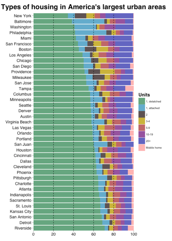
So on this slow papal visit day where everything has come to a standstill, I took Emily and Chris’s idea and applied it to UAs, via ggplot2. Here’s what it looks like for the 40 largest UAs:
A few notes:
- Atlanta looks much less dense. Its suburbs are basically the worst, as Let’s Go LA documents so well here.
- Houston, too.
- Philly drops from lowest detached SFR rate to fourth lowest. Anecdotally this seems right to me, my friends and I having grown up in super low-density Bucks county sprawl.
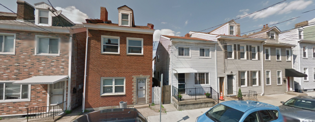
- This data (from the ACS) is self-reported. I wonder how many people misunderstand the question and how this affects the estimates. For example, the data claims there are 5,600 detached single family homes in Manhattan, which is obviously wrong. I also wonder how someone might characterize something like this, which makes up a huge portion of housing in Pittsburgh:
Fun stuff. Maybe another cool angle here would be to measure land area by type of housing, rather than a simple count of units.


