
At City Observatory, Daniel Kay Hertz convincingly demonstrates that affordability can’t always be measured using aggregate figures, like median home value:
For an illustration of this problem, imagine two neighborhoods. In both places, the median home costs $300,000. But in the first neighborhood, every home costs exactly $300,000, while in the second, there are a range of homes from $100,000 to $500,000. Although both neighborhoods have the same median home price, the second neighborhood has some homes affordable to low-income people, while the first neighborhood does not.
More important to our understanding of affordability is the distribution of home prices and rent, which Hertz goes on to explore at the neighborhood level in Chicago. This is an incredibly under-discussed topic in the broader housing affordability debate.
Using census data, I put together an interactive chart that allows us to compare the affordability of American cities at all levels of the distribution — not just the median, as we virtually always see reported. Here’s what it looks like (click to launch):
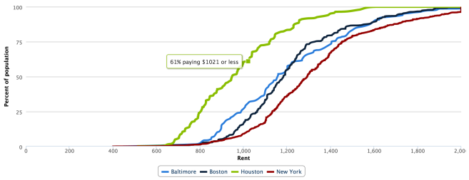
The X axis measures rent; the Y axis measures the percent of the city’s population living in a ZIP code where the median rent is less than X. For example, in the chart above, we see that 61% of Houstonians live in a ZIP code where the median rent is no more than $1021. The further a city’s series is to the right, the more expensive it is.
A few technical notes:
- The data comes from the 2013 5-year ACS estimates. The rent variable is gross rent (includes utilities). Unfortunately, any ZIP where median rent is greater than $2000 is coded as $2000.
- I used ZIP codes, and not a more granular level of geography like census tracts, because the margin of error becomes prohibitively large.
- Cities are defined as census-designated urban areas.
- One drawback here is that the census doesn’t disaggregate rent statistics by bedroom. A $1000 1BR apartment is much more expensive than a $1000 2BR apartment, but here they’re counted as equally affordable. This is only a problem for cross-city comparison if cities are meaningfully different in their makeup of housing stock.
- Remember, this is census data, so it’s representative of all rental units, not just market rate. That’s why, for example, NYC looks relatively inexpensive here, at least compared to cities like DC where market rate housing is cheaper but there isn’t as large a rent-controlled housing stock.
Let me know (on Twitter, ideally) if you have any comments or suggestions!
